Drawing Graphs#
Kind of graphs#
Matplotlib offers several kinds of charts: scatter plots, histograms, bar graphs, pie plots … It is up to you to choose the type that works for your data! The flowchart below can help.
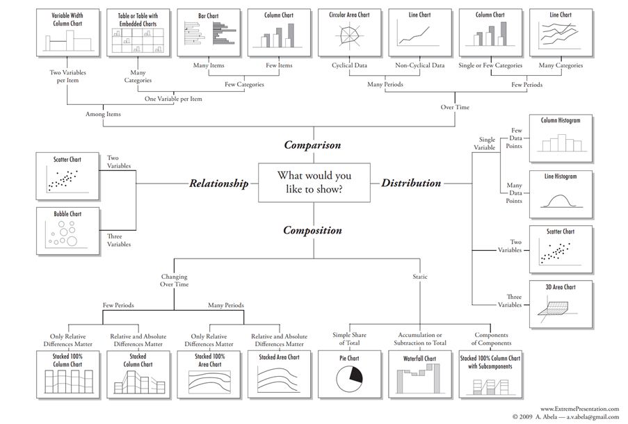
See also the matplotlib plot types page for more information and example Python code!
Plotting line graphs#
We can plot scientific data to visualize how variables are related or how the data vary from sample to sample or if more data are needed or …
We can plot a function (x, y = function(x, parameters)) to see how the function behaves at different values of x or with different parameters.
To create a line graph:
Use matplotlib.pyplot.figure to create a figure object. This is needed when we want to e.g. tweak the size of the figure.
Use matplotlib.pyplot.plot to produce a plot. The first and second arguments are for the x-values and y-values, i.e. the independent and dependent variables. If no x-values are provided, the default is (0, 1, … n-1) with n the length of the y-values. This function has also several optional arguments define basic formatting properties like color (
color), marker (markerandmarkersize), line (linestyleandlinewidth), and names for legend items (label).Color values can be color names or abbreviations, e.g.
black=k,red=r,yellow=y,green=g,cyan=c,blue=b…Markers can be
circles=o,squares=s,triangle up=^,triangle down=v,diamond=D,cross=x…Line styles can be
solid=-,dashed=--,dotted=:…Add features, such as title, axis labels, axis limits, and a legend to the plot using matplotlib.pyplot.title, matplotlib.pyplot.xlabel, matplotlib.pyplot.ylabel, matplotlib.pyplot.axis, and matplotlib.pyplot.legend.
Execute the matplotlib.pyplot.show command to show the plot or the matplotlib.pyplot.savefig command to save the plot as a figure.
See the documentation (follow the links above!) for more information and examples.
Plotting bar graphs#
Bar graphs or bar charts are useful to visualize differences between groups or categories, e.g. comparing the effect of mutations on enzyme activity, comparing the growth of bacterial colonies in different environments …
To create a bar graph:
Use matplotlib.pyplot.figure to create a figure object. This is needed when we want to e.g. tweak the size of the figure.
Use matplotlib.pyplot.bar to produce a plot. The first and second arguments are for the x-coordinates and their corresponding heights. This function has also several optional arguments to define basic formatting properties like bar width (
width, default:0.8), color (color), and error bar values (xerrandyerr; default:None).To rotate the names for the x-coordinates, use plt.tick_params.
Color values can be color names or abbreviations, e.g.
black=k,red=r,yellow=y,green=g,cyan=c,blue=b…Add features, such as title, axis labels, and a legend to the plot using matplotlib.pyplot.title, matplotlib.pyplot.xlabel, matplotlib.pyplot.ylabel, and matplotlib.pyplot.legend.
Execute the matplotlib.pyplot.show command to show the plot or the matplotlib.pyplot.savefig command to save the plot as a figure.
See the documentation (follow the links above!) for more information and examples.
Graphs checklist#
Have you chosen the best graph to share your message?
Is the graph as clear as possible for your audience?
Does the title describe the data?
Are your X- and Y-axes labelled?
Do your X- and Y-axes have units?
Are your data labels and / or legend placed in the best possible locations?
Have you used colors to accentuate key elements in your graph?
Is there a well-positioned legend explaining the different colors / patterns?
…
Examples#
Please pay attention to the use of comments (with #) to express the units of variables or to describe the meaning of commands.
Example
You measured specific binding data (in cpm), in duplicate, of six concentrations of a radioligand (in µM) to angiotensin receptors on membranes of cells transfected with an angiotensin receptor gene. Plot the duplicate experimental data. Identify (by eye) the trend in the data and the data point(s) that could be considered (an) outlier(s).
Lconc = [0.125, 0.25, 0.5, 1.0, 2.0, 4.0]
Cpm1 = [784, 1774, 3272, 6306, 9311, 12168]
Cpm2 = [792, 1645, 3169, 3349, 8756, 11730]
#import the library needed (i.e. matplotlib) and introduce convenient naming
import matplotlib.pyplot as plt

#create the graph
plt.figure(figsize=(5, 4))   #create a figure object, the size is provided in inches (width, height)

plt.plot(Lconc, Cpm1,   #plot a set of (x (= ligand concentrations in µM),y (= specific binding in cpm)) data
         color='g',   #use a green color
         marker='o',   #use a circle as marker
         label="Dataset 1")   #use a legend label

plt.plot(Lconc, Cpm2,   #plot a set of (x (= ligand concentrations in µM),y (= specific binding in cpm)) data
         color='b',   #use a blue color
         marker='s',   #use a square as marker
         label="Dataset 2")   #use a legend label

plt.title('Binding of radioligand to angiotensin receptors', fontsize=16)   #define the graph title
plt.xlabel('$[Ligand]$, µM', fontsize=12)   #define the X-axis label
plt.ylabel('Specific binding, cpm', fontsize=12)   #define the Y-axis label
plt.legend()   #include a legend

plt.show()   #show the plot
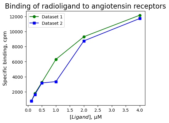
→ We can see a hyperbolic trend. We have not reached saturation yet: there is no horizontal asymptote for increasing \([Ligand]\). It looks like there is an outlier for \([Ligand]\) = 1 µM. Statistical tests or weighted fits are needed (more about this later)!
Example
Use the Michaelis-Menten equation. Calculate and plot the initial velocities of an enzyme-catalysed reaction to investigate what happens when \(K_{m}\) is small / large.
#import the libraries needed (i.e. numpy and matplotlib) and introduce convenient naming
import numpy as np
import matplotlib.pyplot as plt

#create the function
def MichaelisMenten(Sconc, Vmax, Km):
    """
    Calculate the initial velocity of an enzyme-catalysed reaction with the Michaelis-Menten equation,
    using the initial substrate concentration, Vmax, and Km.
    Args:
        Sconc (float), the initial substrate concentration in mM or µM or ...
        Vmax (float), the maximum velocity in mM/min or µM/min or mM/s or µM/s or ...
        Km (float), the Michaelis-Menten constant in mM or µM or ...
    Returns:
        The initial velocity, v0 of an enzyme-catalysed reaction (float) in mM/min or µM/min or mM/s or µM/s or ...
    """
    v0 = (Vmax * Sconc) / (Km + Sconc)
    return v0

MichaelisMenten(6, 40, 2)   #test the function with random but reasonable parameters
30.0
#create substrate concentrations to use as x-values for our function
substratetest = np.linspace(0, 20, 41)   #return 41 evenly spaced numbers between 0 and 20

#create the graph
plt.figure(figsize=(5, 4))   #create a figure object, the size is provided in inches (width, height)

plt.plot(substratetest, MichaelisMenten(substratetest, 40, 5),   #plot a set of (x (= initial substrate concentrations),y (= the calculated initial velocities using the Vmax and Km provided)) data
         color='g',   #use a green color
         linestyle='-',   #use a solid line
         label="$V_{max}$ = 40 µM/min, $K_m$ = 5 µM")   #use a legend label

plt.plot(substratetest, MichaelisMenten(substratetest, 40, 0.5),   #plot a set of (x (= initial substrate concentrations),y (= the calculated initial velocities using the Vmax and Km provided)) data
         color='b',   #use a blue color
         linestyle='--',   #use a dashed line
         label="$V_{max}$ = 40 µM/min, $K_m$ = 0.5 µM")   #use a legend label

plt.title('Michaelis-Menten curve: the influence of $K_m$', fontsize=16)   #define the graph title
plt.xlabel('$[Substrate]_0$, µM', fontsize=12)   #define the X-axis label
plt.ylabel('$v_0$, µM/min', fontsize=12)   #define the Y-axis label
plt.legend()   #include a legend

plt.savefig('figure_enzyme.png')   #save the plot as a figure
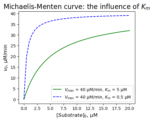
→ We can see a hyperbolic trend. We can see that a small \(K_{m}\) indicates that the enzyme requires only a small amount of substrate to become saturated: the maximum velocity is reached at relatively low substrate concentrations. A large \(K_{m}\) indicates the need for higher substrate concentrations to achieve maximum reaction velocity.
Example
You measured the number of days to flowering for a wild type and six mutants. Plot the findings.
Plant = ["Wild type", "Mutant 1", "Mutant 2", "Mutant 3", "Mutant 4", "Mutant 5", "Mutant 6"]
DaysToFlower = [25, 40, 25, 80, 30, 23, 60]
#import the library needed (i.e. matplotlib) and introduce convenient naming
import matplotlib.pyplot as plt

#create the graph
plt.figure(figsize=(5, 4))   #create a figure object, the size is provided in inches (width, height)

plt.bar(Plant, DaysToFlower,   #plot a set of (x (= wild type or mutants),y (= the measured variable)) data
         color='g')   #use a green color

plt.tick_params(axis='x', labelrotation=90)   #rotate the names for the x-coordinates 90 degrees

plt.title('Number of days to flower for wild type and mutant plants', fontsize=16)   #define the graph title
plt.ylabel('Number of days to flower', fontsize=12)   #define the Y-axis label

plt.show()   #show the plot
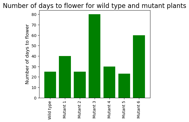
→ We can see that some mutant take more time to flower than others.
Exercises#
Before continuing with the exercises, take some time to play with the code for the graphs above. Can you change line and marker color? Can you change the axis titles? …
Exercise
You measured initial velocities (in µM/s) of an enzyme-catalyzed reaction using eight initial substrate concentrations (in µM) in the absence and presence of 15 µM inhibitor. Plot the experimental data. Identify (by eye) the type of inhibitor.
Sconc = [1, 2, 4, 8, 16, 32, 64, 128]
NoI = [185, 227, 327, 555, 614, 757, 877, 897]
WithI = [15, 48, 155, 180, 300, 404, 624, 830]
Solution
Here’s one possible solution.
#import the library needed (i.e. matplotlib) and introduce convenient naming
import matplotlib.pyplot as plt

#create the graph
plt.figure(figsize=(5, 4))   #create a figure object, the size is provided in inches (width, height)

plt.plot(Sconc, NoI,   #plot a set of (x (= substrate concentrations in µM),y (= initial velocities in µM/s)) data
         color='g',   #use a green color
         marker='o',   #use a circle as marker
         label="Without inhibitor")   #use a legend label

plt.plot(Sconc, WithI,   #plot a set of (x (= substrate concentrations in µM),y (= initial velocities in µM/s)) data
         color='b',   #use a blue color
         marker='s',   #use a square as marker
         label="With inhibitor")   #use a legend label

plt.title('Initial velocities in the absence and presence of inhibitor', fontsize=16)   #define the graph title
plt.xlabel('$[Substrate]$, µM', fontsize=12)   #define the X-axis label
plt.ylabel('$v_0$, µM/s', fontsize=12)   #define the Y-axis label
plt.legend()   #include a legend

plt.show()   #show the plot
→ On the graph, \(V_{max}\), the horizontal asymptote at high \([Substrate]\) looks the same. \(K_{m}\), the concentration of substrate at which the enzyme achieves half Vmax, looks larger in the presence of the inhibitor. This behaviour is characteristic of a competitive inhibitor.
Exercise
Use the following equation: fraction of bound receptor = \([RL]\) / (\([RL]\) + \([R]\)) = \([Ligand]\) / (\([Ligand]\) + \(K_{d}\)). Calculate and plot the fraction of bound receptor to investigate what happens when \(K_{d}\) is small / large.
Tips:
Define a function that calculates the fraction of bound receptor using the equation provided.
Create an array using a fixed number of points, e.g. 1000, between 0 and 100 mM. This will serve as the x-values.
Plot the function for two different scenarios, e.g. \(K_{d}\) = 1 mM and \(K_{d}\) = 10 mM. Use a different color for each curve.
Make sure to include a title, X-and Y-axes labels, and a legend.
Solution
Here’s one possible solution.
#import the libraries needed (i.e. numpy and matplotlib) and introduce convenient naming
import numpy as np
import matplotlib.pyplot as plt

#create the function
def FractionBoundReceptor(Lconc, Kd):
    """
    Calculate the fraction of bound receptor using the initial ligand concentration and Kd.
    Args:
        Lconc (float), the initial ligand concentration in mM or µM or ...
        Kd (float), the dissociation constant in mM or µM or ...
    Returns:
        The fraction of bound receptor in %
    """
    FractionBound = Lconc / (Lconc + Kd)
    return FractionBound

FractionBoundReceptor(18, 1.5)   #test the function with random but reasonable parameters
#create substrate concentrations to use as x-values for our function
ligandtest = np.linspace(0, 100, 1000)   #return 1000 evenly spaced numbers between 0 and 100

#create the graph
plt.figure(figsize=(5, 4))   #create a figure object, the size is provided in inches (width, height)

plt.plot(ligandtest, FractionBoundReceptor(ligandtest, 1),   #plot a set of (x (= initial ligand concentrations),y (= the calculated fraction of bound receptor using the Kd provided)) data
         color='g',   #use a green color
         linestyle='-',   #use a solid line
         label="$K_d$ = 1 mM")   #use a legend label

plt.plot(ligandtest, FractionBoundReceptor(ligandtest, 10),   #plot a set of (x (= initial ligand concentrations),y (= the calculated fraction of bound receptor using the Kd provided)) data
         color='b',   #use a blue color
         linestyle='--',   #use a dashed line
         label="$K_d$ = 10 mM")   #use a legend label

plt.title('Fraction of bound receptor: the influence of $K_d$', fontsize=16)   #define the graph title
plt.xlabel('$[Ligand]_0$, µM', fontsize=12)   #define the X-axis label
plt.ylabel('Fraction of bound receptor, %', fontsize=12)   #define the Y-axis label
plt.legend()   #include a legend

plt.savefig('figure_binding.png')   #save the plot as a figure
→ On the graph, when \([Ligand]_{0}\) = 0, no receptor has ligand bound. When \([Ligand]_{0}\) = \(K_{d}\), the fractional occupancy is 0.50. When \([Ligand]_{0}\) =9 \(K_{d}\), the fractional occupancy is 0.90.
We can see that a small \(K_{d}\) indicates that the receptor requires only a small amount of ligand to become saturated. A large Kd indicates the need for higher ligand concentrations to achieve saturation.
Exercise
You measured specific activities (in U/mg) for wild type and mutant enzyme. Plot the experimental data. Which mutant is the most / least active?
Protein = ["Wild type", "Y46A", "W50A", "R55A", "W171A", "D85A"]
SpecificActivity = [50, 5, 83, 45, 15, 62]
Solution
Here’s one possible solution.
#import the library needed (i.e. matplotlib) and introduce convenient naming
import matplotlib.pyplot as plt

#create the graph
plt.figure(figsize=(5, 4))   #create a figure object, the size is provided in inches (width, height)

plt.bar(Protein, SpecificActivity,   #plot a set of (x (= wild type or mutants),y (= the measured variable)) data
         color=['black', 'darkblue', 'turquoise', 'mediumvioletred', 'orange', 'violet'])   #use a green color

plt.tick_params(axis='x', labelrotation=90)   #rotate the names for the x-coordinates 90 degrees

plt.title('Enzyme activity for wild type and mutant enzymes', fontsize=16)   #define the graph title
plt.ylabel('Specific activity (U/mg)', fontsize=12)   #define the Y-axis label

plt.show()   #show the plot
→ On the graph, we can see that W50A is the most active and Y46A the least active mutant.